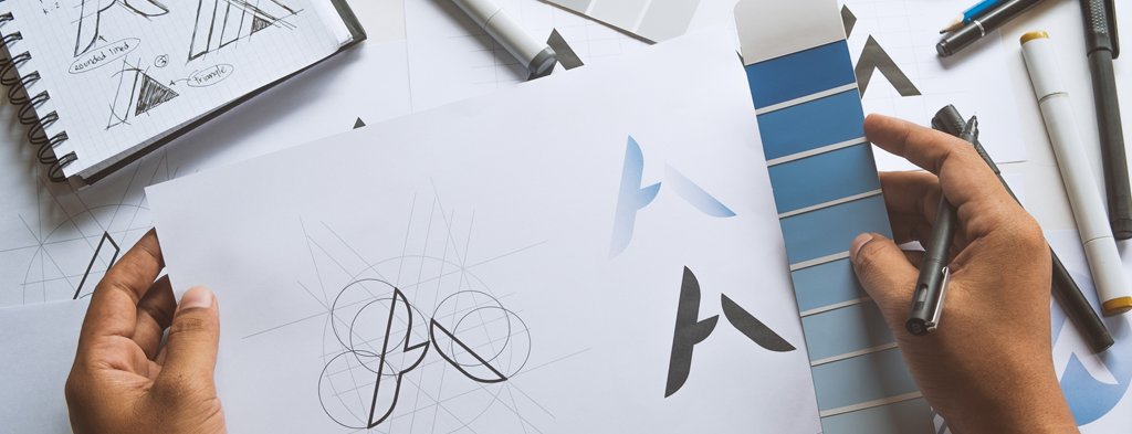
Reimagining your organization’s logo can be one of the most enjoyable and rewarding parts of rebranding. It’s your chance to get creative and think through how to visually express the nuances of your new brand identity.
But to arrive at a logo that will truly represent your brand, there are logistical factors to layer on top of your design choices. After all, your logo won’t always live in the ideal environment of your computer screen. Each gradient, color, line, and shape will also need to come to life. And implementing those features consistently on physical assets like ID badges, workwear, signage, and fleet vehicles is trickier than you may realize.
One way to ensure you can seamlessly implement your logo everywhere it needs to live is to make informed design decisions early in the rebranding process. But the best way is to engage a rebrand implementation partner with a track record of achieving consistent, high-quality results.
To help you understand the unique complexities of translating your logo into real life, here’s how BrandActive helped three large brands apply their logo to their high-profile branded assets.
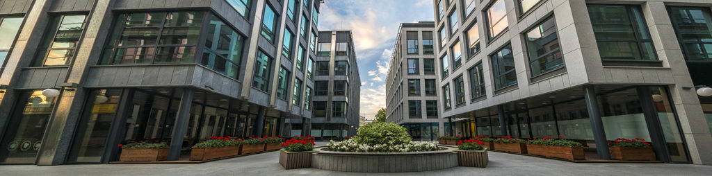
How a global brand implemented its logo’s two-toned look on corporate signage
Color gradients are a fashionable design choice that can help your brand evoke emotion. But subtle differences in shade can easily get lost in translation if you’re not careful. That’s especially true on physical assets like signs — which are visible from multiple angles and can look different depending on the time of day.
So, when it was time for Pfizer to implement its new logo, its branding agency had to do some creative problem solving to achieve the look Pfizer was seeking.
The challenges of marrying design to implementation
Bringing Pfizer’s design choices to life on corporate signage presented the following challenges:
- Signs with dark-colored logos (like Pfizer’s blue logo) are notoriously difficult to see at night. Furthermore, illumination can alter the appearance of the design or wash out the color.
- Two similar colors – dark blue and light blue in this case – that show up beautifully on a screen are often too subtle when applied to a sign. And getting the contrast right between each shade — and against the façade it’s adhered to — is complicated.
- Pfizer is a global company with hundreds of locations. Not all international sign vendors have access to the same materials. Furthermore, application methodologies are not standardized across countries. This presented a significant risk that the brand would be inconsistently applied on a global scale.
Tricky design challenges require clever implementation solutions
To solve these challenges, BrandActive worked closely with Pfizer’s branding agency to brainstorm on-brand solutions as follows:
- Since dark blues are difficult to accurately illuminate, we prototyped solutions that would allow the logo to transition from color to an all-white alternative at nighttime. This also required us to think through how to maintain enough contrast between the logo and the background so the design elements wouldn’t get lost.
- Using an all-white logo eliminated the need to think about color accuracy and visibility. But this added a new challenge. We needed to be sure the relationship between positive and negative space appropriately reflected the brand guidelines. The clever use of block-out film preserved the on-brand appearance of the logo’s shape and silhouette.
- We advocated for flexible brand standards governing how to apply Pfizer’s logo across all their international locations. This involved taking advantage of materials available in each global region rather than insisting that all materials be exactly the same. The overall result was a visually consistent brand experience.
10 steps in a signage rebranding process
Before embarking on rebranding your signage, you will need to consider a multitude of factors. Learn the 10 steps in a signage rebranding process.
Branding agencies are understandably protective of their design. It’s their job to establish brand guidelines so their clients’ visual identity isn’t compromised or watered down. To that end, developing a positive working relationship between the branding agency and BrandActive was critically important. Together, we were able to deliver results that worked both from a design and an implementation perspective.
Regulatory requirements steered this healthcare brand’s approach to applying its logo on fleet vehicles
When a large healthcare organization rebrands, there are often thousands of assets to transition. Getting the logo right in all these places is critically important to preserving the brand’s promise and identity.
But if you need to convert large-scale assets like ambulances and helicopters, the stakes are even higher. Yes, you’ll still want to adhere to brand guidelines. And it’s important to choose types of vinyl and other application materials that will hold up over time. But you also need to make sure you’re following all applicable regulatory requirements. What’s more, these rules and regulations can vary by location, making the situation even more complex.
Such was the case when Centura — a healthcare provider with locations in multiple states — engaged BrandActive to implement their rebrand.
We helped Centura apply their new logo on their fleet vehicles by:
- Recommending appropriate vinyls and other materials that would maintain the brand’s look and feel over time
- Creating standard measurements, minimum font size guidelines, and placement instructions for fleet vendors to follow
- Recommending logo placements for ambulances that factored in the amount of reflective stripes/material required by law
- Determining how Centura’s name, logo, and accompanying design elements should appear when used in conjunction with symbols such as the Star of Life
- Providing guidance on surface areas to avoid (e.g., doors so the logo wouldn’t be cut off; non-stick surfaces where vinyls would easily peel)
- Ensuring phone numbers, fleet identification numbers, and reporting information were displayed according to regulatory guidance
An implementation partner who is familiar with the regulatory implications of rebranding can help you stay compliant from a legal standpoint. And relying on outside expertise in this area also relieves a tremendous amount of stress and anxiety from your internal team.
How an audio brand achieved consistency when rolling out numerous co-branded logos
When Audacy — a multi-platform audio, content, and entertainment company — embarked on their rebrand, they knew their complex brand architecture would pose a unique set of challenges. With hundreds of radio stations under their brand umbrella, they:
- Needed to achieve brand consistency across all their sub-brands and locations without discounting audience attachment to each sub-brand
- Required a flexible way to update signage since their sub-brands tend to change names and logos frequently
- Wanted their logo to come alive in fun, playful ways across all their locations
It’s not enough for your new logo to look beautiful in an ideal digital environment. It also needs to perform well in a variety of physical places and spaces.
Audacy opted to roll out a co-branded logo strategy, depicting their main brand logo on top and the sub-brand logo located underneath, at all corporate locations. But at each radio station, the station name took precedence. This flexible standard approach ensured that each station could maintain their individual identity while achieving a consistent result overall.
Furthermore, to make it easy to change signs when radio station names and call letters changed, BrandActive conceived of a modular panel approach to signage. This continues to allow stations to quickly update their logo or name while leaving other branded elements intact.
Finally, to deliver the playful brand application Audacy was looking for, BrandActive prototyped several solutions using unique materials and textures. This made it possible for Audacy to see their brand come to life in a variety of interpretations and styles before choosing which one best represented their new identity.
A good implementation partner can help your digital logo find its physical form
To represent your brand effectively, it’s not enough for your new logo to look beautiful in an ideal digital environment. It also needs to perform well in a variety of physical places and spaces. That means you need to take time to think about how your design will look on everything from a business card to the side of a 3-story building.
As an introduction to this process, start by printing your logo out on a piece of paper. Take note of how the colors appear. Observe whether gradients, fine lines, and other design elements look the way you think they should.
Then engage an implementation partner to help you test your logo on every physical asset where it needs to appear. Through creative problem solving and thorough prototyping, you can be sure your new logo will consistently and impactfully represent your brand the way you intend.
Ready to take a look at your logo through the lens of rebrand implementation? We can help. Let’s talk.